
Happy 2019!!! I have a very special subject to get the year started right!!
Today and next week is going to be dedicated to accessibility. The posters I will be sharing are created by Karwai Pun and are from accessibility.blog.gov.uk. There are currently six posters in the series and are general guidelines when it comes to the “do’s and don’ts” of accessibility.
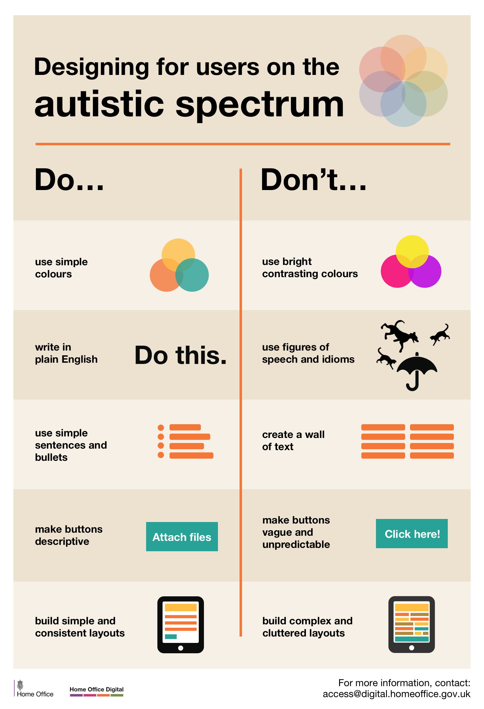
Today’s poster is:
Designing for users on the autistic spectrum
Do

- use simple colors
- write in plain English
- use simple sentences and bullets
- make buttons descriptive – for example, Attach files
- build simple and consistent layouts
Don’t
- use bright contrasting colors
- use figures of speech and idioms
- create a wall of text
- make buttons vague and unpredictable – for example, Click Here
- build complex and cluttered layouts
